Visualize to Organize: Enhance Your Team’s Workflow with Napkin
A Step-by-Step Tutorial
In today’s fast-paced work environment, clear communication is essential but often challenging. With Napkin, you can simplify project planning and help every team member understand their roles in a visual and intuitive way.
Why Napkin?
Napkin.ai is a simple yet powerful AI tool designed for business storytelling and visual thinking, making it easier to organize ideas and streamline communication.
It combines the intuitive design of Microsoft Office with the technical capabilities of Draw.io, offering a user-friendly interface and is currently free to use in its beta version.
If you’re new, head to Napkin’s website and sign up for a free account.

The IDEA Framework for Effective Project Visualization
To create a roadmap that your team can easily interpret and align with, let’s use the IDEA framework:
- Identify key project elements.
- Design clear visuals.
- Enhance them for alignment with team needs.
- Apply these visuals in collaborative settings.
Practical Use Case: Launching a New Mobile App
Imagine your team is gearing up to launch a new mobile app. During planning, you notice frequent miscommunications between the development and marketing teams: deadlines and feature priorities are unclear. With Napkin, you can create a visual roadmap that organizes each phase, making sure everyone understands the project timeline, dependencies, and individual responsibilities.
Step-by-Step Guide Summary
- Identify the Core Concepts
Start by pasting notes from your team’s brainstorming session into a blank Napkin board. Include essential features, department’s deadlines, responsibilities, and key project milestones.
2. Design Visual Representations
Use Napkin’s AI to generate diagrams, trying a roadmap layout that highlights project phases. This ensures every department sees where they fit within the timeline.
3. Enhance for Alignment
Customize your visuals to clarify departmental roles. Use icons for each department, colors to distinguish task categories, and fonts to make the roadmap readable for all.
4. Apply in Collaborative Settings
Invite your team to collaborate on the board, making it a living document where everyone can update and adjust tasks as the project progresses.
By following these steps, you’ll turn your mobile app launch planning from a chaotic process into a clear visual roadmap. This will improve communication and align your team’s efforts toward a successful launch.
Catch the highlights above, and keep reading for a detailed step-by-step guide, along with a hands-on Napkin tutorial!
By the end of this guide, you’ll know how to use Napkin for visual business storytelling and how to create organized project roadmaps. This is just the beginning — more steps will follow to refine your project planning!
Step-by-Step Guide
Step 1: Identify Core Concepts
Start by laying out the basic components of your project in a new Napkin by clicking on “+ New Napkin”.

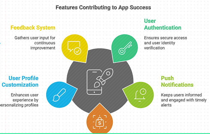
Select a blank Napkin and Paste notes from your team’s brainstorming session onto a blank board, such as key features, as captured below :
User Authentication
Push Notifications
In-App Purchases
User Profile Customization
Feedback and Review System
Pro Tip: Choose a descriptive title like “Mobile App Launch” to keep your project organized and easily identifiable for everyone.
Step 2: Design Visual Representations
Highlight your text and click on the blue thunderstorm icon appearing on the left side. This will trigger a cloud of blue dots as the AI processes your input into a visual.

Napkin’s AI will create a range of diagrams based on your input, presenting multiple styles.
Preview Options: Take a moment to look over your generated diagram. Does it reflect your team’s goals?
Scroll down to see the range of other diagram options:

Another option:

Select a Style: Swipe left to browse options, then choose the one that resonates most with your branding or project style.
The single-color purple option matches the colour of the logo? Then go ahead and pick it. You can also preview the same diagram set against either a dark background (left/up) or a crisp white backdrop (right/down).


Step 3: Enhance
Now’s your chance to get creative and add your personal touch! Customize the chosen design to make it more relevant to your needs.
Icons: Swap icons by clicking the blue thunderstorm next to any existing icon.

Example: Add an icon for “push notifications” to signal the feature.
Before:

After:

Decorators: Use decorators to add emphasis!
I tried adding sparks around the title just to see how it looked — not keeping it, but it was fun to try!

Colors: Choose from a palette of colors to match your team’s style and the aesthetics of the product.
Example: I adjust the subtitle colour from black to purple to align with the brand’s palette for cohesion.

Pro Tip: Use color to differentiate tasks and align with your team’s branding.
Fonts: Select a font style that matches your project’s tone, whether casual or formal.
Just above, you can see how the subtitle’s previous font had a less handwritten, comic-like vibe!

Step 4: Apply in Collaborative Settings
Once your diagram is ready, hit the ‘Share’ button in the upper right corner to invite your team onto the board. Everyone can view and edit in real-time, allowing for task reviews, discussions about dependencies, and adjustments to the features.

Optional: Take It Anywhere and incorporate it into presentations or reports!
Export your designs as .png, .pdf, or .svg files by choosing your preferred format (with .png set as the default) and clicking ‘Download’!

Going Further: Explore a More Complex Business Diagram
Now, let’s say you want to take it further with a roadmap. Paste the full project roadmap you discussed during your team’s morning stand-up, detailing responsibilities and deadlines.

A horizontal diagram with clear deadlines makes it easy to grasp the workflow at a glance. However, without the deadlines, it misses an essential element for keeping everyone on track!

Here are two different styles of the same diagram, both incorporating the deadlines for each phase. The main differences lie in the font and color, each adding its own unique character to the visual representation. If you want to emphasize the dates, consider the second style with its vibrant color scheme.
Does this version capture the entire journey ahead and clearly outline each key milestone?


Choose a roadmap view that highlights the sequence of activities — from initial market analysis all the way to launch day.

The grey hues in the road promote a sense of calm and professional look and the distinctive colours draw attention to specific milestones.
Next Steps: Pro Tips for Intuitive Diagrams
- Use a cohesive color theme aligned with your team’s branding to make visuals recognizable.
- Assign colors or icons to each team member for easy role identification.
- Add contextual icons (e.g., a laptop icon for engineering, a gear icon for development and a megaphone for marketing) to reinforce the relevance of tasks to specific departments.
- Iterate as needed to keep the visuals up-to-date as projects evolve, using Napkin’s collaborative editing capabilities to ensure accuracy.
Benefits of Using Napkin
By incorporating Napkin into your workflow, your team gains:
- Clarity: Clear visualization of each task and responsibility reduces ambiguity.
- Engagement: Interactive features foster real-time collaboration, enhancing team involvement.
- Motivation: Tracking progress visually can boost morale and productivity.
Potential Drawbacks to Consider
While Napkin offers high customization levels, the range of templates can be somewhat limited, making it challenging to find perfect matches for complex needs. Also, as a web-based tool, a stable internet connection is necessary for smooth functionality.
Exploring Alternatives
If you’re interested in exploring other tools, Highcharts GPT and DataGems are great alternatives to Napkin for creating compelling data visuals and infographics.
Thank you for reading! Ready to enhance your next project with visual clarity? Dive into Napkin and create your first diagram to experience the benefits firsthand. I’d love to hear your thoughts or experiences with Napkin in the comments — let’s continue the conversation!